Strategic Shopify UI/UX Design and Transformative eCommerce Experiences
Written and edited by: Dirk
Normally, I’d begin a piece like this with some properly overeducated snark about how every SaaS vendor and their Pinterest-addled cousin has been promising “transformative digital experiences” since approximately Obama’s first term. I have, as they say, seen some things. Witnessed the rise and fall of Flash intros. Survived the great skeuomorphic leather texture plague of 2012. Watched as “disruptive” became a word that meant nothing at all because it was applied to everything including, memorably, a subscription service for artisanal mayonnaise. So you’ll forgive me if the word “transformative” in the headline, but that’s what we’re talking about.
When it comes to UI and UX design for Shopify stores, the transformation that matters isn’t the mystical creative variety promised by design agencies drunk on one too many Apple keynotes. It’s the utterly unglamorous, highly measurable, surprisingly predictable transformation that can happen when online merchants stop treating design as decorative and start treating it like retail infrastructure.
Don’t trust me here, get sucked in by the numbers. Like. According to research from Forrester that’s been cited so often it’s something somewhat like scripture for UX practitioners, every dollar invested in UX design yields a return of $100. That’s a 9,900% RO. Design-centered companies outperformed the S&P 500 by 228% over a ten-year period. And the Baymard Institute, whose research I’ll be leaning on heavily because they’ve spent like 200,000 hours studying e-commerce usability rather than just making things up, found that mid-size to large online stores can improve their conversion rates by 35.26% with better checkout design alone.
Not “up to” 35%. Not “in some cases.” On average. Just by optimizing the checkout. That translates to roughly $260 billion in recoverable lost orders annually across US and EU markets. That was billion with a B. Which is to say, there’s a quarter-trillion dollars sitting on the table because retailers randomly decided form labels were optional and credit card fields shouldn’t auto-format.
Why UI/UX Can Make Or Break Online Sales
The fundamental mistake most retailers make when thinking about UI and UX is treating it as a separate line item. As if design lives in its own little silo, adjacent to but distinct from brand strategy on one side and conversion optimization on the other. As if you could build your brand identity in one meeting, hand off your “look and feel” to designers in another, and then bring in Conversion Rate Optimization (CRO) experts later to fix whatever’s broken. This architectural approach to design decision-making produces stores that feel like Frankenstein’s monsters. The branding says premium and minimal. The product pages say “we installed seventeen apps but none of them can talk to the others.” The checkout says “we panicked and added more form fields because legal told us to.”
UI and UX design isn’t a department or a project phase. It’s the connective tissue between who you say you are and whether people believe you enough to give you money. Your brand positioning makes promises. Your user experience either keeps those promises or reveals them as fiction.
Consider what happens when a retailer who positions themselves as effortless and curated then subjects shoppers to a checkout flow that requires account creation, presents seventeen form fields by default, hides shipping costs until the final step, and takes four seconds to load on mobile. The brand promise dies the moment the experience contradicts it. And the numbers bear this out brutally.
70.22% of shopping carts are abandoned before checkout. Seven out of ten consumers add items to carts but leave without buying. And when shoppers were surveyed about why, the responses weren’t revelatory. 48% cited high costs. 26% said creating an account would’ve been a hassle. 22% said checkout was too long or too complicated. 21% couldn’t see total costs upfront. 18% didn’t trust the site with their payment info. These aren’t aesthetic failures. They’re strategic errors expressed as user interface design decisions.

Design Can Impact Conversions Immediately
Users are going to form an opinion about your store site in roughly 0.05 seconds. That’s fifty milliseconds. You may want to read that again. Roughly the time it takes to blink. In that fractional moment, before any conscious evaluation occurs, shoppers have already decided whether your store feels trustworthy, professional, and worth their attention. This seems unfair, and it is. But the takeaway isn’t that retailers should exclusively obsess over above-the-fold design strategies. The takeaway’s that every subsequent interaction will either confirm or contradict that initial impression. So. The first impression opens the door. Sustained impressions close the sale.
In other words a Shopify store might pass the 50-millisecond test with elegant typography and tasteful photography. But if the product filtering feels clunky, site search results return irrelevant matches, the mobile experience requires too much pinching and zooming, the checkout flow stalls on a confusing address form. Each point of friction accumulates so that by the time shoppers reach the payment page, they’ve formed a deeper opinion than they did at first glance. But 70% of them will abandon their carts anyway.
That’s why investing in UI/UX research, design and optimization has to be considered strategically rather than simply aesthetically. You’re not buying prettier pixels. You’re buying the consistency between brand promise and lived experience across every touchpoint. You’re buying the elimination of doubt, friction, and cognitive load at each step of the purchase journey. You’re buying trust.
Mobile UX Is Essential For e-Commerce Success
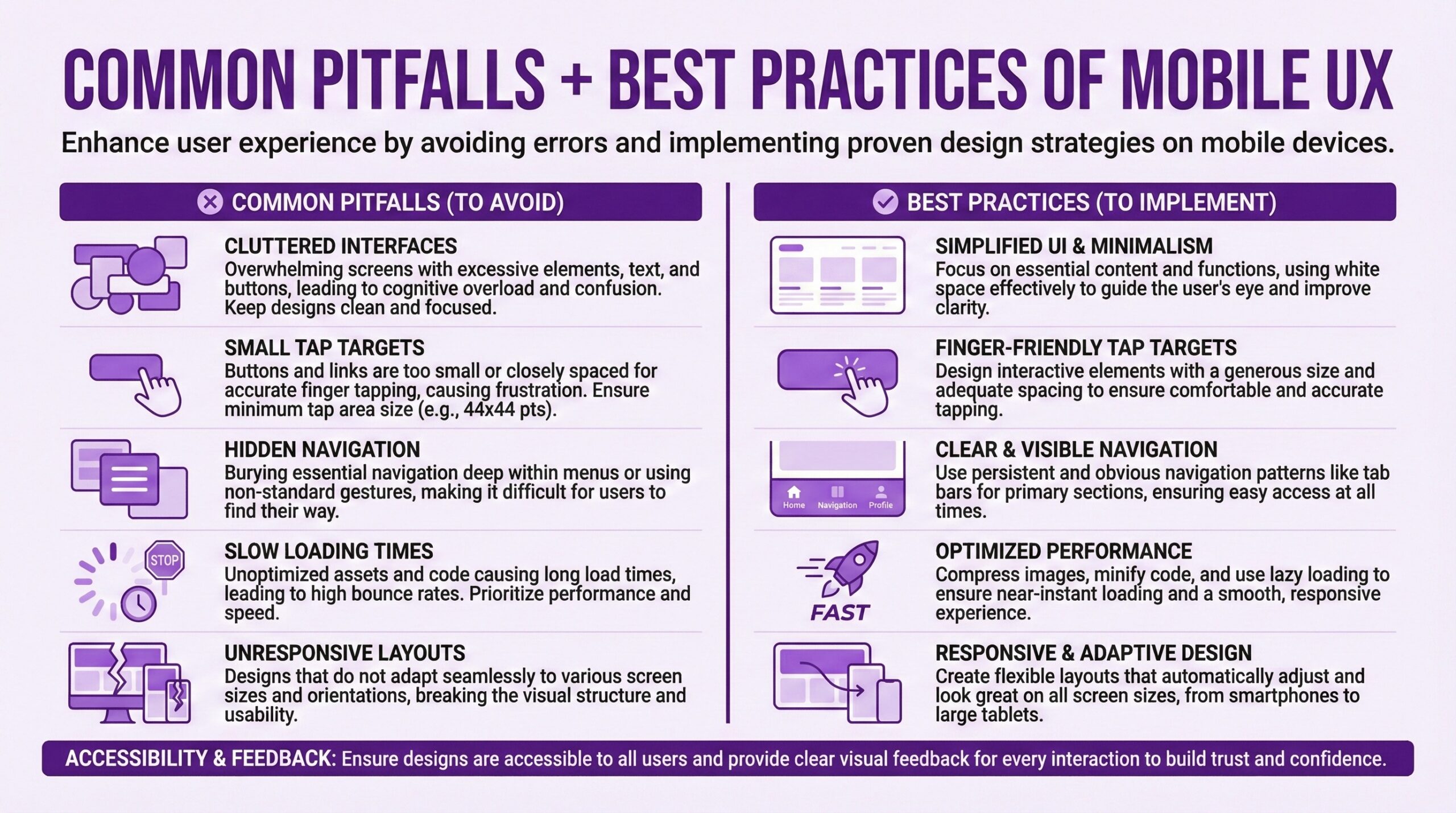
Let me share a number that should concern any merchant who hasn’t audited their mobile experience recently. Mobile devices now account for over 70% of e-commerce traffic globally. But mobile conversion rates average around 2.8% compared to desktop’s 3.2% to 3.9%.Think about what that means. The majority of your shoppers are arriving on a device where they’re approximately 25% less likely to actually buy something. And mobile cart abandonment rates run around 84.8%, aka a lot higher than desktop’s roughly 74%.
That gap doesn’t exist because mobile shoppers are weirdo window-shoppers and desktop users are super serious buyers. It exists because most e-commerce experience strategies still treat mobile as a shrunken desktop rather than a fundamentally-functionally different interaction paradigm. I mean. Small targets. Slow loads. Form fields designed for keyboards rather than thumbs. Checkout flows that were never really thoroughly tested on actual phones are still common even though 50% plus has been the norm for years.
Shopify stores that have been designed and optimized as mobile-first experiences, not just with responsive layouts that technically render on smaller screens but that offer mobile-native interactions, consistently outperform category averages. Mobile apps convert 130% higher than mobile sites. Like. Decreasing mobile load times by just 0.1 seconds led to an 8.4% increase in retail conversion rates in one widely cited study I’ve seen. And this isn’t magic. It’s just taking the average user’s average purchase journey seriously.
The Hierarchy of e-Commerce UI/UX Investment
If you’re a Shopify merchant trying to figure out where to invest limited resources in UX improvements, there’s a rough hierarchy of needs that can be gleaned from the research. Not every online store will follow it exactly, but it’s a generally genuinely useful starting point.
Tier One, Fix What’s Broken. Performance issues. Broken flows. Obvious usability failures. If your site takes more than three seconds to load on mobile, start there. If your checkout flow has unnecessary steps or confusing form validation, start there. If your product search returns garbage results, start there. These aren’t glamorous improvements. Nobody will notice them except in their absence. But according to research compiled by Portent, sites that load in one second convert three times better than those that load in five seconds. Every 100 milliseconds of improvement nudges conversion rates up by roughly 1%.
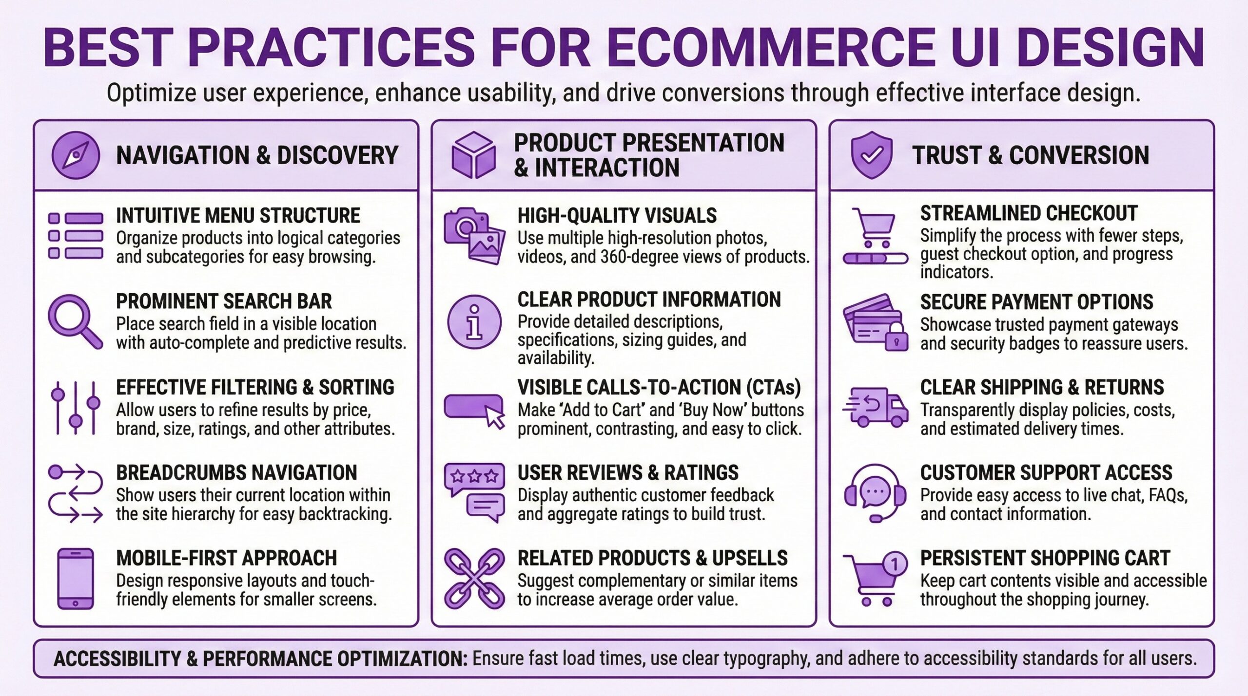
Tier Two, Reduce Friction. After you’ve fixed what’s broken, focus on reducing friction at high-dropout points. The research suggests that most checkouts could achieve a 20-60% reduction in form fields shown to users by default. The average checkout contains 23.48 form elements. An ideal checkout can be as short as 12-14. Guest checkout should be the most prominent option, but 62% of sites fail to make it so. Progress indicators reduce abandonment. Real-time validation prevents errors. Showing total costs early, including shipping, prevents the sticker shock that causes 48% of abandonments.
Tier Three, Enhance Trust. Once performance and friction are addressed, trust signals become the bottleneck. Reviews matter enormously. Products with 11-30 reviews show approximately 68% higher conversion rates than products with fewer reviews. Security indicators matter, particularly during checkout. Clear return policies matter. Professional photography matters. Consistency between advertising and landing page experience matters. If your Facebook ad shows one aesthetic and your store delivers another, you’ve created a trust violation that no checkout optimization will fix.
Tier Four, Delight Strategically. Only after the fundamentals are solid does it make sense to invest in the “delight” layer that design agencies love to sell. Animation. Micro-interactions. Personalized experiences. Visual flourishes. These can absolutely improve conversion and brand perception when layered on top of a solid foundation. But they can’t rescue a slow, frustrating, untrustworthy experience. Delight is earned, not imposed.
UX Design And Improving Site Search Conversion Rates
One area that deserves attention involves product search. Users who use site search convert at rates two to three times higher than non-searchers. This makes sense. Someone who types a query has high purchase intent. They know what they want. They’re not browsing. Yet 22% of websites don’t present the search field prominently on the homepage. And according to usability testing, when search is available, it often fails users through poor result relevance, no tolerance for typos, inability to handle synonyms, and insufficient filtering options.
This represents a missed opportunity. If your highest-intent visitors are the ones using search, and your search experience disappoints them, you’re specifically failing the customers most ready to buy. Investing in search infrastructure, whether through Shopify’s native capabilities, third-party apps, or more sophisticated solutions for larger catalogs, often delivers outsized returns.
UX Design Psychology Can Predict Consumer Behavior
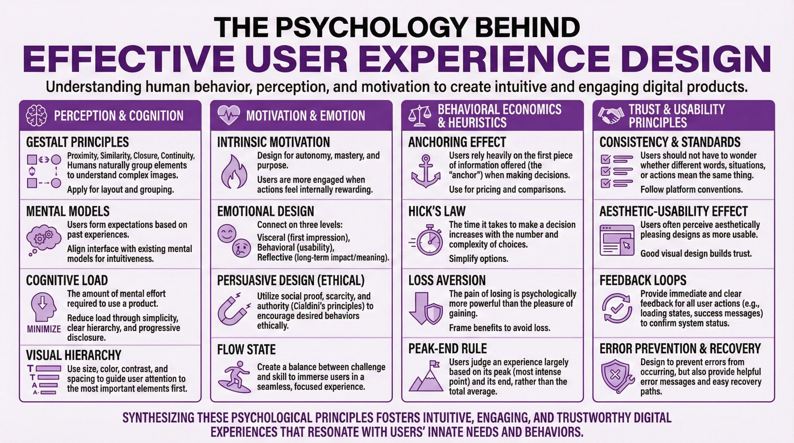
Beyond mechanics, effective UX for online retail requires at least some understanding of how humans actually make decisions. Not how they “should” make them. Not how we’d like them to make decisions. How they actually behave with all their cognitive biases, limited attention spans, and emotional shortcuts. So a few principles from behavioral research translate directly into design guidance.
Cognitive load is the enemy. Humans have limited processing capacity. Every decision, every form field, every navigation choice consumes some of that capacity. When cognitive load exceeds capacity, people take shortcuts, make errors, or abandon the task entirely. Effective UX reduces cognitive load through progressive disclosure, sensible defaults, clear information hierarchy, and simplified decision paths. Amazon’s one-click purchasing isn’t just convenient. It eliminates the cognitive load of checkout entirely for returning customers.
Social proof isn’t optional. 66% of consumers report that they will become repeat buyers after a personalized purchasing experience. But more fundamentally, shoppers look to other shoppers for validation. Reviews, ratings, bestseller badges, “people also bought” recommendations, even simple purchase counts all serve as social proof that reduces purchase uncertainty. If your product pages lack social proof elements, you’re asking shoppers to make decisions in an information vacuum.
Loss aversion shapes behavior. People feel losses more intensely than equivalent gains. This principle suggests that framing matters. “Don’t miss out” resonates more than “Take advantage.” Countdown timers work because they create urgency around avoiding loss. Low-stock indicators work similarly. Exit-intent popups that offer discounts work because abandoning now feels like losing the discount. The ethics of these tactics can be debated, but their effectiveness is well documented.
Friction can be strategic. This seems to contradict everything I’ve said, but there are moments where deliberate friction serves the customer. A confirmation step before a large purchase. A pause before finalizing a subscription. A summary screen that ensures the order is correct. Strategic friction prevents regret and reduces returns. The key distinction is whether friction serves the customer’s interests or just the retailer’s convenience.
Elements of Effective e-Commerce UI/UX Design
For retailers trying to justify UX investment to stakeholders who think in spreadsheets rather than user flows, the ROI case can be presented fairly concretely.
Start with current state metrics. What’s your conversion rate by device? What’s your cart abandonment rate? What’s your average session duration and bounce rate? What percentage of site searches result in zero results? What’s your mobile versus desktop conversion gap?
Identify specific improvement opportunities. Use the research, your own analytics, and session recording tools to identify specific failure points. Is checkout abandonment high at the shipping information step? Are mobile users bouncing from product pages at unusually high rates? Are searchers abandoning after seeing results?
Model conservative improvement scenarios. If checkout optimization typically yields 20-35% conversion improvement, model a 15% improvement. If mobile optimization typically closes 20-30% of the mobile-desktop conversion gap, model 15%. Apply these conservative estimates to your current traffic and average order value.
Calculate payback period. Compare the estimated revenue impact against the cost of proposed UX improvements. Most substantive UX investments pay back within months rather than years when the numbers are run honestly. The 9,900% ROI figure from Forrester is an aggregate across many companies and contexts, but even a tenth of that return makes most UX investments worthwhile.

What This Means For Partner Agency Selection
If you’re considering hiring a design agency, understanding the strategic role of UX should inform how you evaluate potential partners
Beware of pure aesthetics. Partner Agencies that lead with visual portfolios but can’t articulate how design decisions affected business metrics are selling decoration, not transformation. Ask about conversion impacts. Ask about bounce rates. Ask about mobile performance improvements. If they can’t answer with specifics, they may not be measuring what matters.
Demand discovery before design. Any design agency worth hiring should insist on understanding your current state before proposing solutions. What are your analytics showing? Where do users struggle? What devices dominate your traffic? An agency that jumps straight to mockups without this foundation is designing blind.
Understand their testing philosophy. Good UX isn’t static. It’s iteratively improved through testing and measurement. Ask how they approach A/B testing. Ask how they validate design decisions. Ask what happens after launch. An agency that delivers and disappears may produce something beautiful that doesn’t actually perform.
Check platform expertise. Shopify has specific conventions, capabilities, and constraints. An expert or agency experienced with Shopify will understand what’s feasible within the platform versus what requires custom development, which apps play nicely together, and how to optimize within Shopify’s infrastructure. Generic “web design” expertise doesn’t automatically translate.
Getting Expert Help With UI/UX Design for e-Commerce
UI/UX design investment isn’t a one-time project. The landscape shifts. Customer expectations evolve. What felt effortless three years ago feels dated today. The stores that sustain competitive advantage through user experience treat it as an ongoing discipline rather than as a completed initiative. This doesn’t mean constant redesigns. It means continuous measurement, incremental optimization, and willingness to revisit assumptions when incoming data suggests they’re wrong. It means budgeting for UX and UI maintenance the way you budget for inventory or marketing. And much as I wish it were, none of it is magic. It’s just taking numbers seriously and orienting design accordingly.
Frequently Asked Questions (FAQ)
What’s a good conversion rate for a Shopify store?The global e-commerce average hovers around 2-3%, with Shopify stores specifically averaging between 2.5% and 3%. If your store converts above 3%, you’re already performing better than most. Well-optimized stores regularly achieve 4-5% or higher. The key benchmark isn’t an absolute number but rather your improvement trajectory and how you compare to stores in your specific category.
How much should I budget for UX improvements on my Shopify store?
There’s no good way to answer this. I mean. Your budget depends on current state and scope. Minor checkout optimizations might run $2,000-5,000. A comprehensive UX audit with implementation recommendations typically costs $5,000-15,000. Full redesigns with UX research, strategy, and implementation can range from $15,000 to $100,000+ depending on store complexity. The relevant question isn’t what UX costs but what poor UX costs you in lost sales. If you’re converting at 1.5% when 3% is achievable, that gap represents real revenue.
What’s the single highest-impact UI?UX improvement I can make?
For most e-commerce stores, checkout optimization will deliver the highest immediate impact. Research has found that better checkout design can improve conversion rates by 35.26% on average. Specific quick wins include making guest checkout prominent, reducing form fields, showing shipping costs early, adding progress indicators, and improving mobile checkout usability.
How do I know if my mobile UX design is actually good enough?
Test it yourself on several actual phones, not a desktop browser simulator. Can you complete a purchase using only your thumb? Does the site load in under 3 seconds on cellular? Are tap targets large enough to hit accurately? Does checkout require excessive scrolling or form correction? If your mobile conversion rate is more than 30% below desktop, your mobile experience likely has substantial room for improvement.
Do I need to hire a UX specialized partner agency or can I improve it myself?
It depends on the issues. Some checkout optimizations can be implemented through Shopify’s native settings or well-reviewed apps without agency involvement. Performance improvements often require technical expertise. Major redesigns benefit from professional UX research and design skills. Start by auditing your current experience against published best practices. Address the obvious problems first. Then evaluate whether remaining issues require expert help.
How long does it take to see results from UX or UI improvements?
Well. Performance improvements, such as faster page loads, show immediate impact in analytics. Checkout optimizations typically show measurable results within 2-4 weeks given sufficient traffic. Broader design changes may take longer to evaluate properly because you need statistical significance. Plan for at least 4-8 weeks of monitoring after any significant change before drawing conclusions about impact.
What’s the relationship between Brand Identity design and UX design?
Brand Identity design establishes visual identity, personality, and positioning. UX design ensures that customers can actually navigate and transact with your store effectively. The two should be inseparable but often aren’t. A beautiful brand design implemented with poor UX will frustrate customers despite looking sophisticated. A highly usable store with weak branding will convert but struggle with differentiation and loyalty. The best outcomes integrate both.
Should I prioritize desktop or mobile UI/UX design improvements?
Check your analytics. If mobile traffic substantially exceeds desktop traffic, which is typical since mobile now accounts for 70%+ of e-commerce traffic globally, prioritize mobile. However, don’t ignore desktop user experience entirely, especially if your average order value is significantly higher on desktop, which is also common. The goal is parity between experiences, not sacrificing one for the other.